Strangling Carmel to death
The February 11 Carmel Pine Cone reported that the Pilgrim's Way bookshop on Dolores Street had
attempted to brighten up their storefront only to bring the
aesthetics police to their door. This skinny little independent
bookshop felt that their business was difficult to notice and needed
a little boost to catch people's eyes. They decided to repaint with a
“tan-ish orange” hue, topped with a nice textured topcoat of a
somewhat brighter color to catch the eyes of passers by.
But the planning commission came
along and said “No” to the faux finish and pointed out that city
regulations require storefronts to have “muted” colors that
“blend with the natural surroundings.” In other words, don't
stand out from the crowd.
This incident reminds me of another one a
few years back when a motel owner made a simple little fence out of
posts with a rope strung between them. The city decreed that it
looked too “industrial” and ordered the rope replaced with common
wooden rails.
I know these regulations are
intended to protect Carmel's image, keep the commercial district from
looking too urban, discourage tasteless designs, and prevent the
invasion of formulaic corporate architecture. In short, to keep
Carmel Carmelish. There's nothing wrong with that in theory, but
Carmel's rules have become so rigid, so locked into its own design
formulas, that they have stifled the very sort of creativity that
made Carmel a unique village in the first place.
Starting in the 1980s, when pricey
galleries and tacky T-shirt shops began crowding out mom and pop stores,
stricter regulations were enacted to preserve Carmel's way of life.
In reality, however, those rules have changed Carmel so radically
that today's regulators would throw hissy fits if anyone tried to
bring back the things that once made Carmel a real town.
Back in the '60s Dolores Street had a
movie theater, a hardware store, and a sleazy tavern. On the SE
corner of 7th there was a modern bank with bright yellow tile
covering the facade from sidewalk to roof. Speaking of bright
facades, Kips grocery on the NW corner of Ocean and San Carlos was
painted bright green on both street-facing sides. That building is
now plain vanilla.
Ocean Avenue had a fabric shop, a hobby
shop, and a barber shop in a block that was anchored by
Sprouse-Reitz, a chain variety store. Believe it or not, the
townsfolk begged the corporate owners to keep the “dime store”
open when the company left town in the mid 1980s. Across the street
was an ice cream parlor with purple and white striped awnings over
arched windows. Next door, on the corner of the block, was a Chevron
station, one of seven service stations (as they were then called) up
and down San Carlos. The only one that survives is the Shell station
at 5th, but at 6th there was a 76 station (NW corner) and a Phillips
66 (NE). At 7th there was a Texaco station (NE), a Mobil station (NW)
and a Ritchfield – later called ARCO - station (SW) where my dad
bought tires once. Full-color corporate logos adorned every one of
them, mostly on metal or wooden signs, scaled down to
Carmel-appropriate proportions.
On Mission and 6th, where the library
annex stands today, there was a small supermarket of the Purity
chain, complete with automatic electric doors. On the opposite side
of Devendorf Park, at the entrance to Carmel Plaza, Sambo's pancake
house, a popular chain restaurant, served their famous tiger butter
with every meal. And down across from the Pine Inn, my dad had a
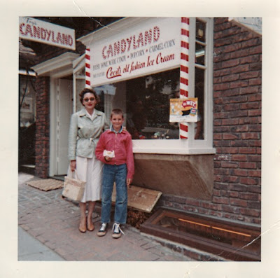
candy store with the name “Toy's Candyland” emblazoned in red and
white striped letters on the storefront advertising his hand-made
candies, popcorn and Cecil's ice cream. While it caused a stir among
the town's more conservative residents, the law saw no need to
intervene. Years after the store was gone, people were still coming
up to us telling us how much they missed it.
 |
| Friends Lois and Chris Robinson outside my dad's store at Ocean and Monte Verde in the early 1960s |
That was the real Carmel. Few of those
businesses would be allowed now, much less their facades. Today's
Carmel is so locked into its formulas that visitors often come away
with the impression that it's an artificial town, manufactured to
look cute just for them – and their money – like Disneyland
without the rides.
I have tremendous love for Carmel's
quirky and sacred traditions, and I have spoken out from time to time
to protect them. But this notion that Carmel must look picture
postcard perfect from every conceivable angle is a relatively recent
phenomenon. It is just as disruptive to Carmel's character as
standardized corporate chain store architecture would be, precisely
because it is itself a form of standardization.
There's a fine line between protection
and overprotection and it was crossed sometime in the last twenty
years. Architectural review and historic preservation are important,
but it's time to put some slack in the reins. Just as you have to let
children at some point define their lives on their own terms, Carmel
needs to let its community members express their creativity in their
own way. Business owners need to respect their surroundings, but they
also need the freedom to run their businesses and maintain the
appearance of their shops as they, not the bureaucrats, think best.
Comments
Post a Comment